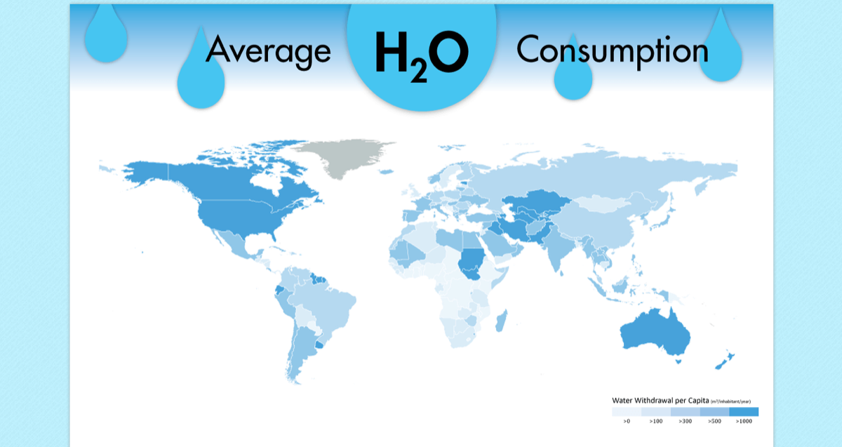
This interactive visualization of water use was created for the UVA School of Architecture's "Year of Water" initiative. I chose to focus on the different water uses across countries--and came across the problem of classifying country size. I created an interactive bubble diagram where the user has control of the variables and can change how they would like to compare countries' water use. Raw data was acquired from the United Nations' AQUASTAT database, then read live with PHP to determine the form of the bubble graph.
Tools: Emacs, Adobe Illustrator, Photoshop
Technologies: PHP, SVG, HTML, CSS


