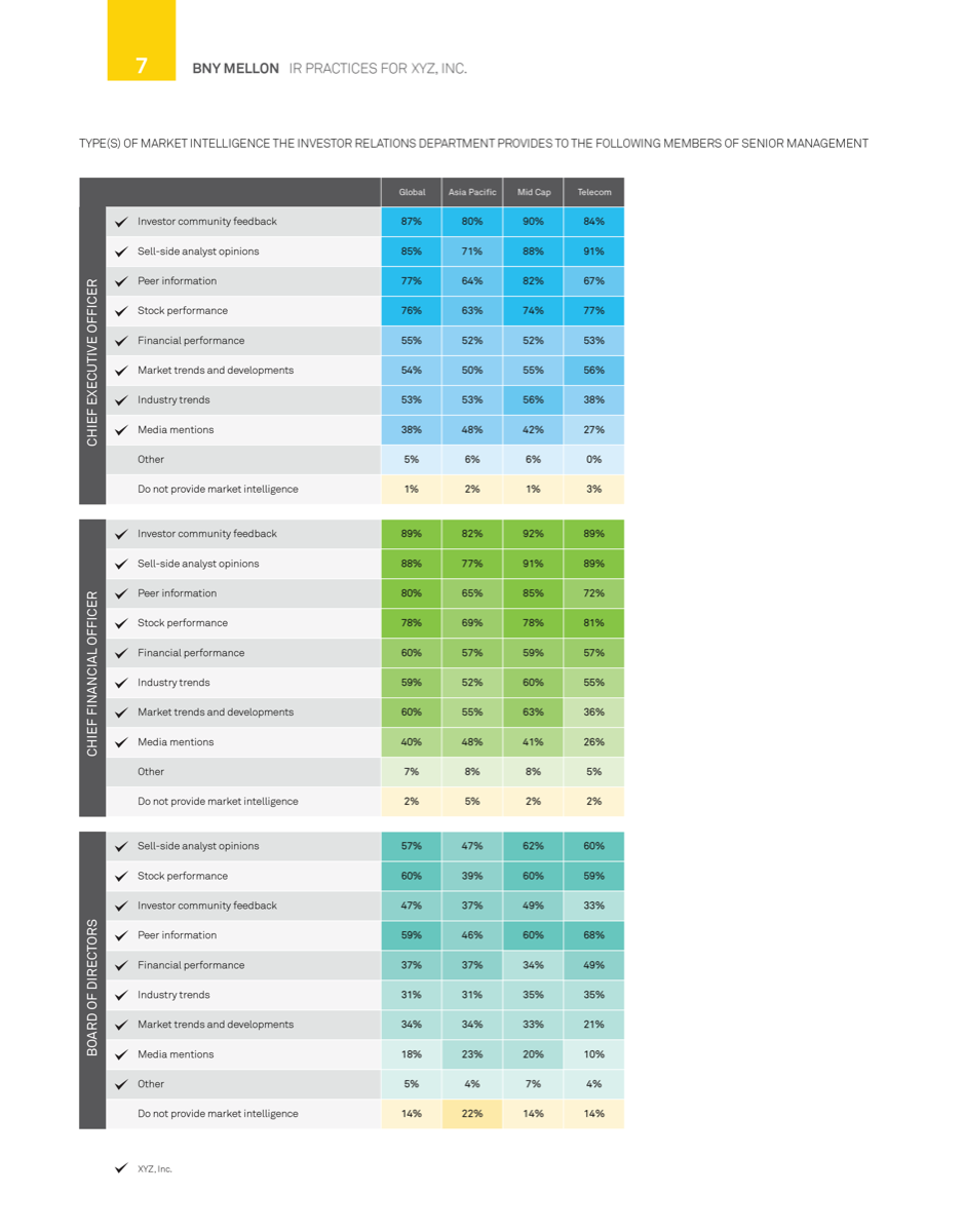
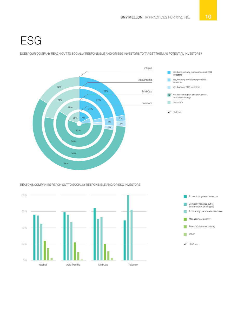
I’m super into automated reporting as a route to efficiency (and as a challenge); this project is where I caught the bug. BNY Mellon does an investor relations survey every year and wanted to publish a huge variety of aggregations of the collected data (without the corresponding amount of design production time it had required in the past). My interdisciplinary team at Boost Labs came up with a plan based on the Region, Industry, and Company breakdowns that BNY requested to standardize the data groupings and comparisons and enable us to use 10 templated chart types to display every survey question for every breakdown.
We used D3 to generate the charts in-browser as svg elements, then downloaded the generated report and used it as a support for the InDesign document required by the BNY team.
Results
For the 2013 survey (published in 2014), we automated the production of reports for over 700 individual companies, 11 industries, and 9 regions (plus 3 translations). Although development of the process took ~3 months, the final report production took more like 3 days.
BNY returned to Boost Labs for production of the 2015 survey results, and after a small number of adjustments necessitated by updated brand guidelines, we were able to easily produce and deliver this year’s batch of reports.


Similar Projects
Based on our experience with the automated reporting tool for BNY, we’ve created similar automated tools for other clients. There has been some re-architecture and refactoring based on lessons learned, new requirements, and other refinements, but I’ve really enjoyed continuing down the path of chart templatization.
One particular project had more custom and complex spread layouts (as well as data that is more variable than survey responses), so we began using Backbone.js as an MVC framework for viewing charts within each page. For full “export to PDF” functionality we use wkhtmltopdf, bypassing the previous need for InDesign and post-processing.