Bloomberg Graphics
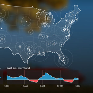
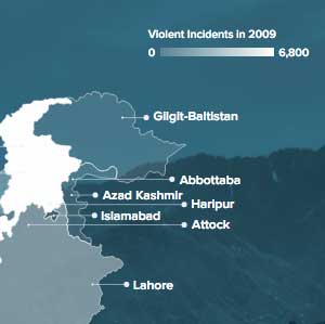
My work at Bloomberg is varied and covers everything from publishing infrastructure and templating to breaking news graphics. I've munged data and created flexible interactive charts for data-driven evergreens: Bloomberg Businessweek Best B-Schools 2020-21, Bloomberg Data Dash: A Live Climate Scoreboard for the World, and Jobs Numbers: Who’s Hiring in America—and Who’s Not. I've worked on high-pressure, high-volume reporting dashboards for events with real-time results, most recently the 2020 U.S. Elections, 2019 U.K. General Election, and 2019 European Parliament Elections. I also get to help my fantastic data journalist and reporter colleagues create standalone stories such as Streaming TV Costs Add Up as Americans Add More Services, This Year’s Wild Hurricane Season Is an Ominous Sign of What’s Ahead, Mapping America's Underwater Real Estate, and Here’s Who Owns the Most Land in America.
Prior Consulting Work